Thursday, July 31, 2008

Ghost Gallery 2

It's been a long time since I posted anything (I have a long pretentious post in the works) so, for the moment how about some more great cartoon ghosts! 


"The Nut Factory", a Cubby cartoon from 1933, has one of those plot-lines that could have only happened in the early 30's. Cubby is a detective called in to solve the mystery of some missing dentures. He is detoured through a haunted house for some reason (I guess because the footprints led there) before finding out that squirrels have the dentures. Makes sense to me. Love the inverted bowling-pin ghosts! 

'gotta match?'

"Ghost Town Frolics", a Meany, Miny, Moe cartoon  (mislabeled as an Oswald) from 1938, comes from the most maligned period of the Walter Lantz studio. Although the monkey protagonists are nothing to write home about (the studio had no engaging characters in the late 30's), there are some great ghosts such as the dancing condoms above and some terrific mood.


I love the opening - times are tough in the world of ghosting. Bummer.


Ghosts are bitter.

 Dick Huemer had already been gone two years by the time of "Scrappy's Ghost Story" (Mintz Studios 1935) but there continued to be some very good Scrappy cartoons. Among those was this one - a true ghost extravaganza! The following year the series took a plunge in quality unrivaled anywhere else in animation.  


 The ghosts in this cartoon have a strange doily-like fringe at the bottom and fingers like open sausage casings or some sort of deep sea plant life.


An Iwerks-ian moment. I would love to see a 35 print of this some day ...

Oddly enough, I became familiar with the cartoon's soundtrack before even knowing what it was from. The song "I'm a Ghost" appeared as an unlisted 'hidden' track on the CD "Halloween Stomp" (1990, Jass Records)

a wonderfully atmospheric scene of Oopy dancing in front of the fire.

Thursday, July 10, 2008

Influences? (wild speculation)

Just for fun I'm going to take a biiig stretch but hey, that's what blogs are for right?

Something I've always wondered about was the cross pollination of entertainment in the 'golden age'. We all know the stories of how artists from other animation studios would visit theaters showing Disney films to try and figure out new aspects of animation.  But was the flow of inspiration one way only? 

The first thing I ever noticed in this regard was the opening to "A Car-Tune Portait" (A Fleischer Color Classic cartoon from 1936) and its similarity to a much better known film: "Fantasia" from 1940. Did the Disney artists see "A Car-Tune Portrait"? Were both influenced by something earlier?

"A Car-Tune Portrait" (1936)
"Fantasia" (1940)


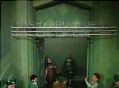
To stretch even further is this scene from "The Wizard of Oz" (1939) wherein Dorthy and Co. get spruced up for their meeting with the wizard and a similar 'sprucing up' sequence from 'All's Fair at the Fair' (1938).

"The Wizard of Oz" (1939)

"All's Fair at the Fair" (1938)


Obviously the simlarities are less evident here than the example above. However the color styling (greens), the influence of art deco (which is I suppose not unusual for the late 30's ) and the general concept (a futuristic salon) do bear perhaps a tangential relationship. 


The likely suspect connecting the two is  the poster  and advertising design of the two major World's Fairs of the 30's: Chicago and New York.  Even so, I am always for some reason reminded of  "All's Fair at the Fair" whenever I see the Emerald City sequence of 'Oz'.

Friday, July 4, 2008

Happy 4th of July

Thursday, July 3, 2008

"All's Fair at the Fair" mosaic

I think I've seen this done elsewhere (ah what the hell) but here's a ruff mosaic of the pan that opens "All's Fair at the Fair" (click to enlarge). Enjoy!

Tuesday, July 1, 2008

First I was blind ...

It's amazing how print quality can change the experience of watching a cartoon. No where is this more apparent than in the Fleischer cartoons. Whereas Maurice Noble's backgrounds benefit  in brightness and crispness from restoration there is little new detail revealed in the process. In fact, they are just as legible in shop-worn 16mm prints as remastered 35 thanks to their spare detail and limited palette and generally flat design. The Fleischer cartoons, particularly the color cartoons, are another matter altogether. One need look only as far as the recent Popeye 2 reeler cartoons to see what I mean. Those who's first experience seeing these cartoons was the recently issued Popeye DVD sets have no idea what a fortunate thing it is that these were saved. Take a trip to your local Wal-mart and pick up "Popeye Cartoon Festival Vol.29" for 2 bucks and you'll see what I mean! Today, however, I am posting grabs from the film "All's Fair at the Fair" - a Color Classic cartoon from 1938 which I was fortunate enough to receive from a french broadcast. 


gasp!


I love the juxtaposition of the old and the new: a horse and carriage in an environment of pure science fiction  


This is how print quality can change an experience. I never even noticed that this scene was making use of a setback!

I want to live in this place! The composition is constantly drawing the eyes in to the characters at center and only then beyond into the depths of the setback.  Backgrounds nowadays are usually a grudging conceit to the story or a hyper realistic CG mess which send the eyes in all directions. 

gorgeous!

Part 2 soon!